User experience is a tricky thing. There are a myriad of articles, blog posts, and plenty of research on how to offer a great user experience. However, in my mind, they all boil down to one simple goal: delight your users.
There are a vast number of ways you can delight your users, from offering a great product or service, amazing customer support, or a clear and easy to use website. Obviously, each of these categories can be further broken down and distilled into smaller parts. At Kibin, we’ve been primarily focused on the quality of our service and customer support, but we’re now making greater strides to improve the usability of our product. In the next few months, we’ll be improving on everything from our editing application, user dashboard, homepage, and sign up flow.
Today, we’re pushing a more informative and user friendly sign up, upload, and purchase process. These changes have been largely driven by conversations with users via our live chat feature and email.
One of the most delightful experiences is when someone is telling you about a product, service, or even something that happened to them and they answer your questions as they pop into your head. It’s incredibly frustrating when you have a question, expect an answer, and it isn’t immediately, or ever, addressed. At the same time, it’s not always easy for the story teller to know what questions their audience may have. This results in a huge disconnect that can only be bridged through practice and conversations.
One of the clearest examples of this occurred when I was pitching people for potential investment in Kibin. I gave dozens of pitches and presentations and learned something new from each one. At the end, my audience would ask questions. Sometimes these would be things I failed to address while some were wanting more information on things I only slightly touched on. After just a few pitches, I began seeing trends and adopting my pitch to address these questions throughout my presentation. The result was a much more finely tuned pitch that allowed for more in-depth discussion at the end. My pitch had greatly improved and I was “converting” investors at a much higher rate.
We’re now doing the same thing with Kibin, and today marks our first iteration around this theme. Our sign up, upload, and purchase pages are more user friendly in their design and contain snippets of information designed to answer the most common questions we get on our chat support and email.
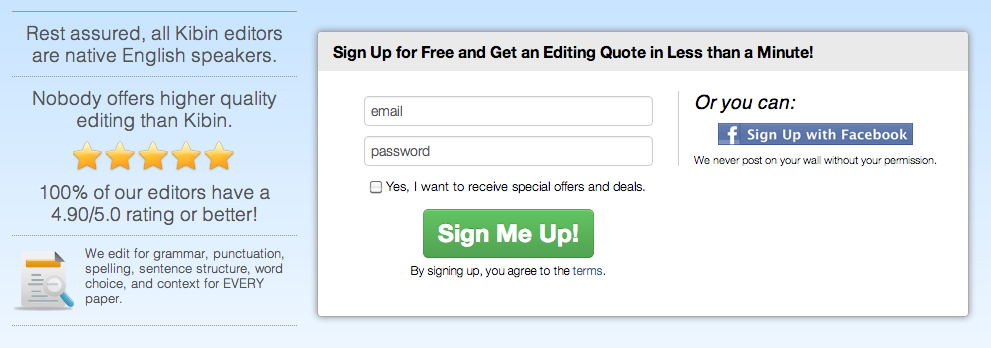
Our new sign up page, for example, is designed to answer some of the most pressing questions our users have asked us before they sign up. Our goal is to help alleviate any concerns and convert a greater number of them to actually take the step to sign up.
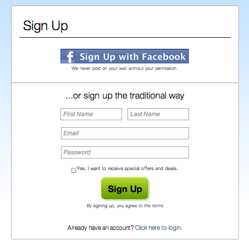
Here’s what our old sign up page looked like:
Compared to our new sign up page:

Our upload and purchase pages are also newly designed with the same goal in mind: we want to delight our users by answering their questions as they make their way through each step.
How will we know this new design is better and measure success? If a greater number of users that view each step move on to the next, we know we’ve made a visible improvement to our site’s usability. But we’ll also probably experience fewer customer questions on our live and email support.
Within the next week or two, we’ll pushing out a new usability improvement once again. Stay tuned for that update and let us know what you think about this one. If you’re already a Kibin user, this may not affect you, but would it have helped answer your questions and made you more comfortable with giving us a try the first time? Let us know in the comments below!
